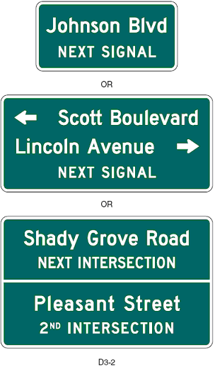
 When The Wife and I came back from the Berkshires in western Massachusetts at the end of August, there was a terrible street sign. I mean “terrible” in terms of its efficacy.
See the bottom of the three signs above? It’s like that, only with four or five different pieces of information, and all the listings in the same font size and design, one line apiece. No arrows, as in the second sign.
One of the bits of information was that one should take I-90 west at the next left. My wife is driving and she didn’t discern it. I’m in the passenger seat, and I’m thinking, “Did that sign say what I think it said?” as we’re going by it at 45 mph. It wasn’t until we were through the intersection that I saw in my left peripheral vision a sign for I-90; otherwise we would have missed it.
Now if that green sign had had that red, blue and white interstate logo, I’m almost certain that our brains would have interpreted the information sooner.
(So, New York Erratic, you would have gotten REALLY lost here.)
I think about this kind of stuff, a lot, actually, especially since our NYS SBDC office put out a book called What’s Your Signage a decade ago. I had virtually nothing to do with the book except that I was doing the bulk of the reference at the time because the others were so busy with the text. While it’s geared towards a business’s signs, there are some information, about logos and color and size, e.g., that would be applicable for road signs as well.
